
Over the weekend, my friend Jim texted me about how much he can’t stand the Red Sox yellow and blue uniforms. My thought on these threads appears later. Jim and I speak occasionally of the multitude of Major League Baseball uniforms and which ones stand out in a positive way for us. For the vast majority of teams’ unis, I have nothing bad to say. If I don’t bring up a certain uniform, it doesn’t mean I don’t like it. In the interest of time and space, assume that if it not mentioned, I like it. The ones I mention, I like them just a little bit more. However, there is one that is definitely a thumbs down.
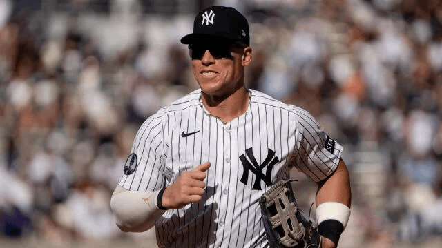
First, the teams we follow:
The New York Yankees have the best uniforms. Hands down. Nothing beats the classic look of the pinstripes. Simplicity is beautiful. I also like being reassured that the Yankee Pinstripes will be around forever. I like the slight alternation of the road uniforms that was done a couple of years ago. They remind me of the road uniforms the team wore in the 1930’s. The Mets should never lose the classic orange and blue pinstripes. The black uniforms were a nice touch when they debuted two decades ago. The Phillies’ off white with red lettering look is a nod to their uniforms in the 1940’s and 50’s. Their classic blue with maroon caps always make me smile. All three teams have looks that bring me back to the innocence of my youth.
Let’s get the bad one out of the way. I agree with Jim. The Red Sox yellow and blue is a terrible look for a classic organization. They look more like the UCLA Bruins. than the Boston Red Sox. However, this doesn’t overlook the slick navy tops that they break out every now and then.
As for the rest (in no particular order)…
The A’s, with either their mostly green or mostly gold tops rate highly, a callback for the only other team besides the Yankees to win three consecutive World Championships. Dodger Blue, namely the white uniforms with blue lettering, is a great look. Since their inception, the Rockies have had sharp unis, such as the home white with purple pinstripes and the alternate purple ones worn for over 25 years. It always brings a smile to my face when the Orioles break out the classic orange jerseys. Their black ones are pretty cool as well. I enjoy the Twins’ home white unforms as a throwback to their days prior to the Metrodome. The Cardinals’ classic look of blue uniforms with red writing and the two birds also brings back nostalgia. The Guardians’ home whites and road grays are simple but effective. It is hard to believe that the White Sox home whites with black pinstripes and road black with white lettering began over 35 years ago. I do have one request. The Washington Nationals need to wear the uniforms of the Montreal Expos, just one more time.
Generally speaking, I am indifferent to the City Conect uniforms. I get the allure but I like the more traditonal ones that teams wear. Some City Connect jerseys are better than others. That being said, nothing beats the look and feel of a Major League Baseball uniform.
 Threeunassisted